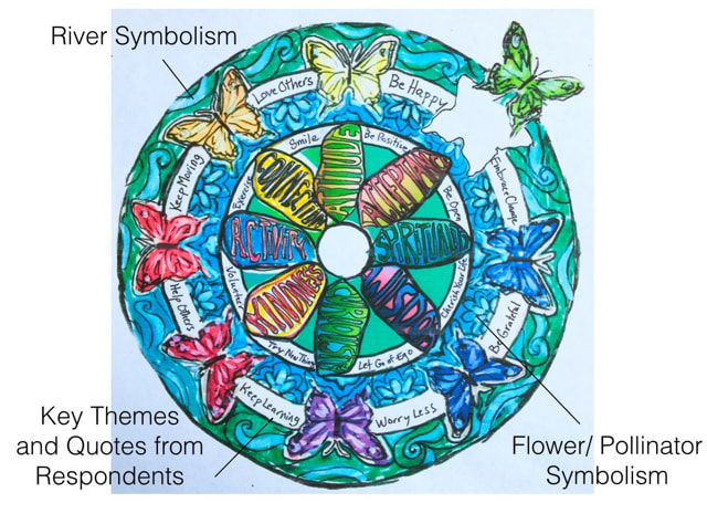
8 Key Themes emerged from the research to help one have a positive experience with aging:
Positive Attitude
|
Spirituality
|
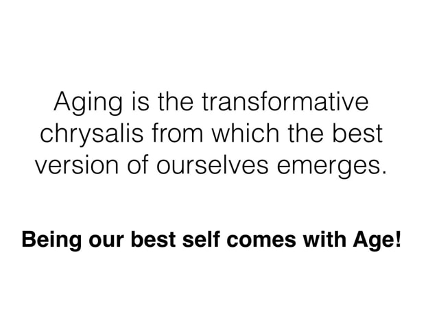
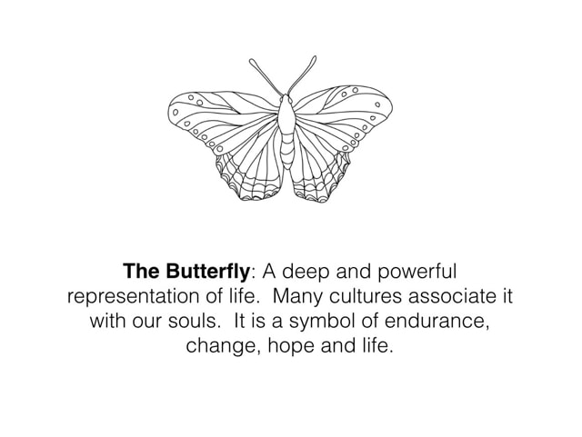
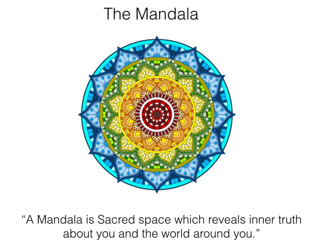
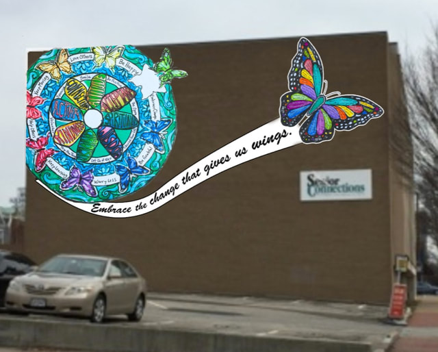
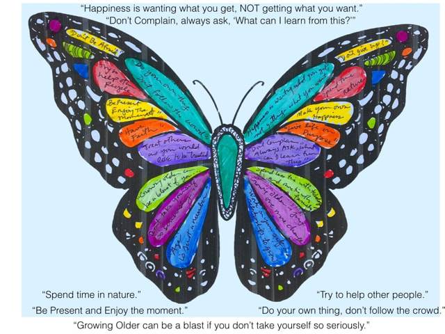
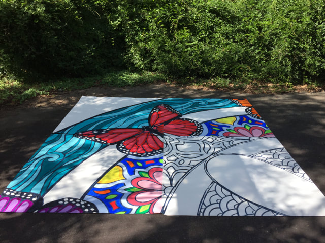
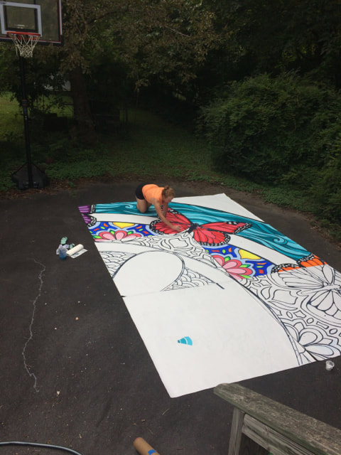
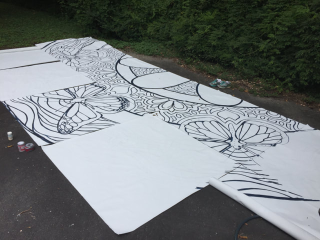
Coming up with a design that respected and reflected the valuable insights of my interviewees and survey respondents was very important to me. Rather than seeing aging as something to be dreaded, I came to see it as a transformative phase, like a chrysalis, from which the best version of ourselves emerged. This, and the vibrant beauty of my interviewees, naturally led to some butterfly imagery and floral elements hinting at the importance of pollinating this information. The next inspiration was the circle, symbolizing the unifying experience of aging, the oneness of life, and the cycle of life. This led to the idea of the Mandala. Also, influencing the circular nature of the design was the rose window and the idea of a kaleidoscope. The kaleidoscope spoke to me as it is just little broken bits of glass that only come together when you look from a certain perspective and allow light to pass through! This reenforced the idea that Transformation and Perspective were key aspects to the design and theme. I also felt it was important to hint at the Freedom that came with age that my interviewees expressed. I symbolized this with a large butterfly (filled with their quotes) taking off and flying free from the mandala with a banner behind it for the title of the project which we fine-tuned to "Transforming Perspectives." In the mandala, I wove stylized imagery of the river to tie in with the importance of the James and the idea of "going with the flow", that so many interviewees encouraged!
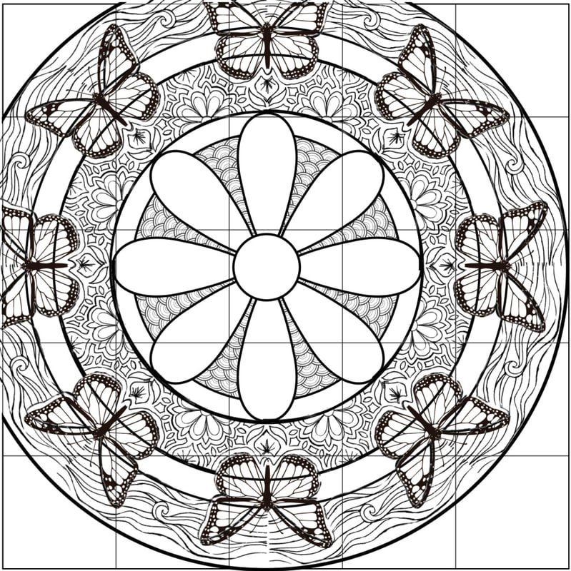
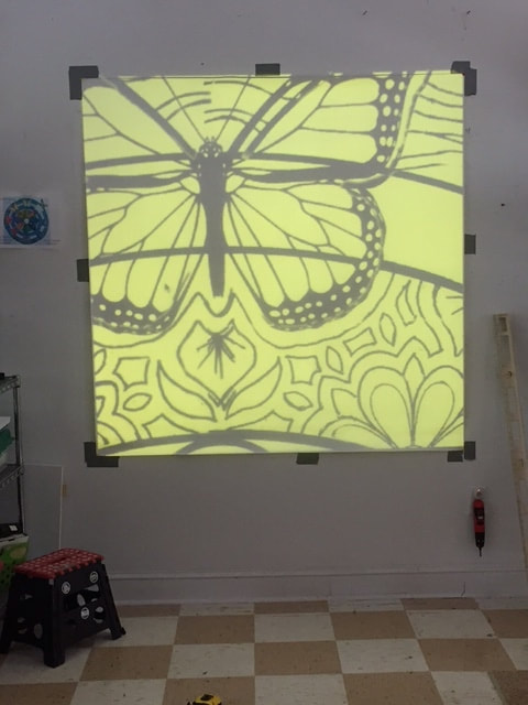
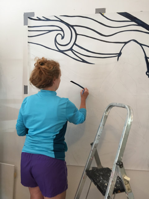
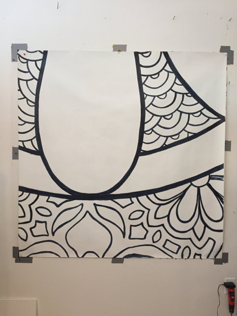
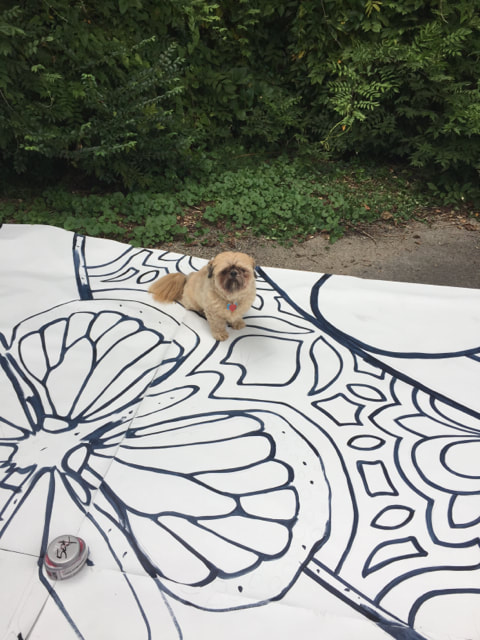
Once I had the concept design, I had to divide it into a grid and project each segment onto a 5x5 foot square fabric panel. The difficult part was that I couldn't put more that one or two together in my studio and as the project proceeded, I had to lay out the panels on my back driveway - and it still wasn't enough space. I had to break the 1000 sq. foot design up in to sections in order to make sure the lines and seams lined up. In the end, I prepped over 40 panels in order to take the mural out to the community for the paint parties. I lost track of how many tints and colors I ended up creating in order to give the mural its' bold colors!
Once I had the concept design, I had to divide it into a grid and project each segment onto a 5x5 foot square fabric panel. The difficult part was that I couldn't put more that one or two together in my studio and as the project proceeded, I had to lay out the panels on my back driveway - and it still wasn't enough space. I had to break the 1000 sq. foot design up in to sections in order to make sure the lines and seams lined up. In the end, I prepped over 40 panels in order to take the mural out to the community for the paint parties. I lost track of how many tints and colors I ended up creating in order to give the mural its' bold colors!